By: Yvonne Liu
Stairs shouldn’t be the only option.
For people with mobility issues, a common curb is another stumbling block. A short flight of stairs requires extra travel time. And the task of mentally mapping every elevator and escalator in the building.
Navigating public spaces with mobility issues is challenging. And architects should be making it easier for them.
But that is the exact opposite of what the New York-based Steve Holl Architects did at Queens Public Library at Hunter Point.
The library has been in the news for years over its accessibility problems. Costing more than $40 million and finished in 2019, the library’s book stacks can only be reached by flights of stairs.
Executive director of the Center for Independence of the Disabled, Sharon McLennon-Wier, recently described it in the New York Times as “a monument to stairs.”
The library has had several lawsuits. Tanya Jackson, who has mobility issues, sued the library in 2019. The City of New York filled a lawsuit against Holl’s office, saying the building did not comply with the Americans with Disabilities Act.
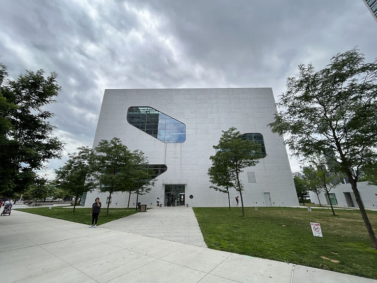
No matter your mobility, the library was designed in a way that makes it difficult to navigate. The library is an 82-foot-high rectangular prism with asymmetrical windows. The atrium draws daylight to the ground floor. It adds light and is highly Instagramable. However, the atrium takes up a LOT of real estate. The result? Uncomfortably narrow passageways.
In a 2019 news report about the building, it was noted that stroller parking clogged the entrance to the second-floor elevators. The curving atrium walls make storage difficult. Racks of book carts are spilling off the sloped floor into the librarian’s workspace.
Did the architects not know right angles might be better for a building whose whole point was to contain books? Apparently not.
The stepped mezzanine is both inaccessible to wheelchairs, but also book carts. Was the plan of this architecture to give librarians a workout carrying mountains of books up and down the endless stairs?
This library is a key example of aesthetics being taken too far to the point where the structure has become inaccessible and impractical.
But a simple walk around the library reveals a structure where architects have elbowed out basic function, to an ivory tower that some can only see from afar.


