


By: Coco Xu
What makes a flag “good?” What makes a flag “bad?” Why are some flags better than others? And why must you never include words on any flag?
Welcome to vexillology, the study of flag design. It’s not as simple as it sounds; it’s not like you can stamp your seal on a blue background just to get it over with (I’m talking to you, all of you 24 U.S. states that do this).
Right, there are a few principles and laws regarding designing a flag that a flag designer must follow. Here, I’ll break down the main principles.
1. Keep it Simple
The first and foremost law of flag design is that it has to be simple—something even a 7-year-old can draw from memory. The design must be easily recognized from a distance on a flagpole, even when there is no wind. A good flag usually contains one unique symbol, a few large shapes, and bold, contrasting colors.
2. Use Meaningful Symbolism
Every visual element on a flag—the shapes and the colors—should represent something that relates to a country, state, or city’s key values. Flag-worthy symbols must be simple yet unique and resonate with citizens.
Colors can make for wonderfully representative yet simple symbols, as each hue carries meaning. For example, red represents strength, blue means freedom, and white is for peace. In fact, this color scheme is so meaningful that it has been used in countless flags, like those of the United States, France, and Russia.
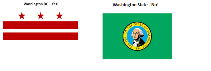
DC’s flag does a better job of serving its purpose by including a classic symbol of the Washington family as opposed to literally putting Washington’s face on the flag.
3. Use 2-3 Basic Colors
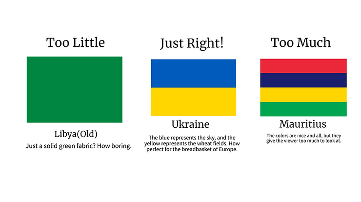
When used well, colors on a flag have valuable symbolism. But when there are too many of them on a flag, they can be overwhelming and defeat the entire purpose. Using too little colors, on the other hand, can make a design look boring and unfit for public display.
It is recommended that a flag is limited to three colors, usually red, blue, green, black, yellow, and/or white. Other colors, like purple, gray, and orange, are occasionally used, but they are not necessary for a good design.
4. No Lettering or Seals
If there’s anything about U.S. states that are worth making fun of, it’s the flags.
More than half of state flags are composed entirely of a seal in the center of a solid background. Others have bold lettering somewhere on their flag.
These types of designs, called seals-on-a-bedsheet, or S.O.B.s, are unfavorable because they defeat the purpose of a flag. Why put time and effort into keeping a design simple yet meaningful when you could just write “USA” or “Oregon” on a flag?
Furthermore, while flags are designed to be seen from a distance on a flagpole, seals are meant to be seen up close on a sheet of paper. They simply contain too much detail to be put on a flag.
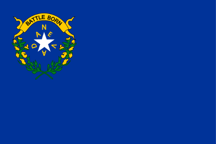
State flag of Nevada, U.S.A. Who even bothers to read the words from meters away?
5. Be Distinctive or Be Related
This is arguably one of the most difficult principles out of the five; sometimes, it seems like all the “good designs” are “already taken.” However, it is important to keep in mind that flag designs can reflect other flags—without copying them, of course.
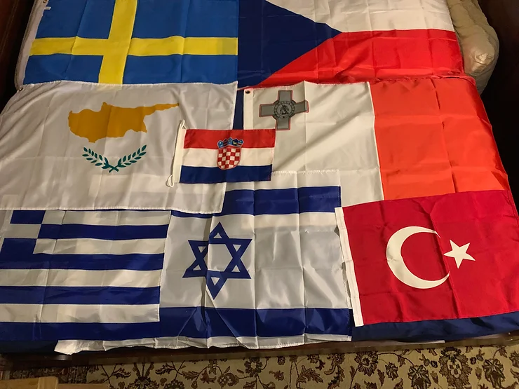
For example, take the flag of Iceland. Its design is reminiscent of the flags of other Nordic countries, such as Norway and Sweden. Even so, it is easily distinguished from the rest, each color representing something unique to Iceland.
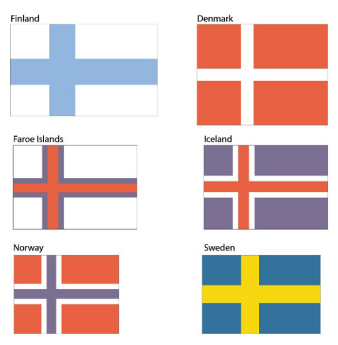
The Nordic flags. Source: Vectorportal.com.
Other Considerations
Besides a flag’s general design, its shape should also be considered. Usually, a flag is rectangular with width-to-length proportions between 1:1.5 and 1:2, though departing from these restrictions with purpose could give rise to some quite unique designs.

One of the most iconic flags of the present day, Nepal’s flag is the only nonquadrilateral national flag. Its unique shape represents the mountains of the Himalayas.
Additionally, most symbols are placed in the “canton” area, or the top left corner. This improves visibility when a flag is hanging limp against the flagpole.
And while the five previously described principles serve as overall guidelines for flag design, there are always exceptions that achieve the purpose of a flag just as well. South Africa is a classic example: although its flag contains all six basic colors, each color has meaning, and the design is simple enough to be recognizable.
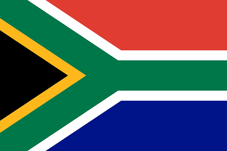
Flag of South Africa.
Red: Bloodshed & sacrifice on the road to freedom
White: The cleansing of the past
Black: The African community
Yellow: Mineral wealth & bounty of the land
Green: Fertile farmland
Blue: Ocean, water, & sky
The “Y”: Merging & unity of the diverse society